Photographic printing

Professional Photographic Printing

A photograph often holds its character in subtle transitions: the separation of dark values, the colour of a quiet highlight, the detail at the edge of a subject. We approach the print as the final interpretation of those decisions.

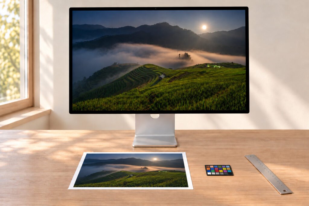
Retouching desk with a landscape photograph on screen, a test strip, ruler and loupe
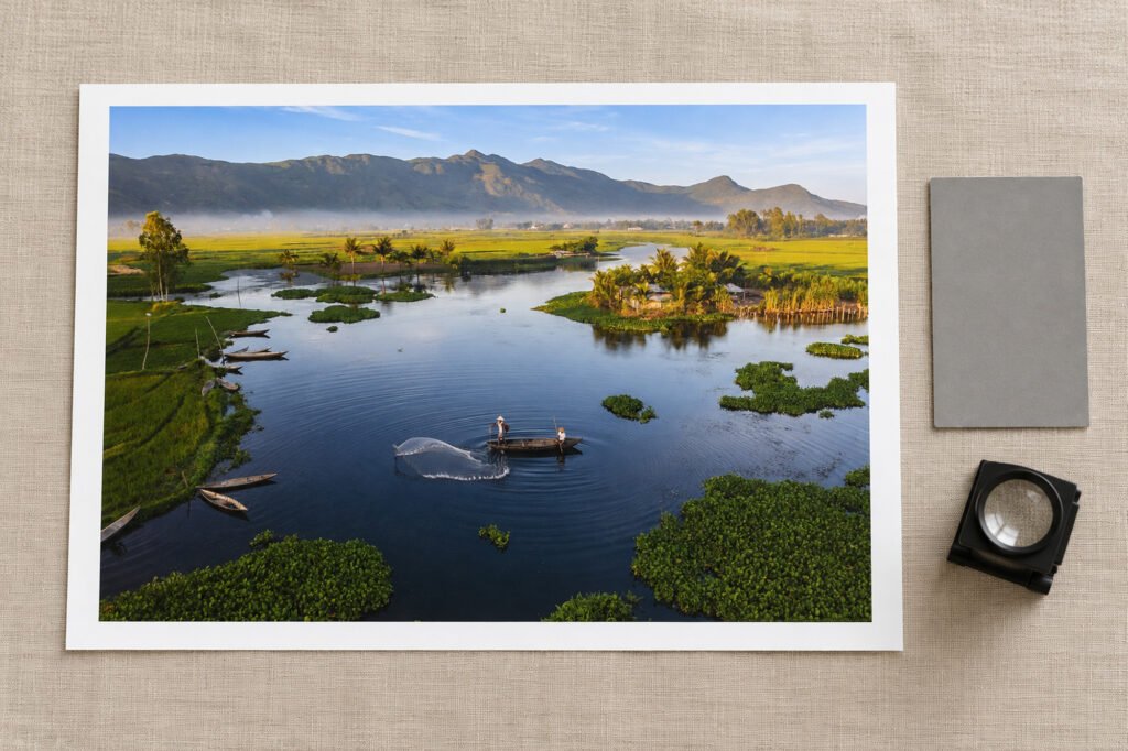
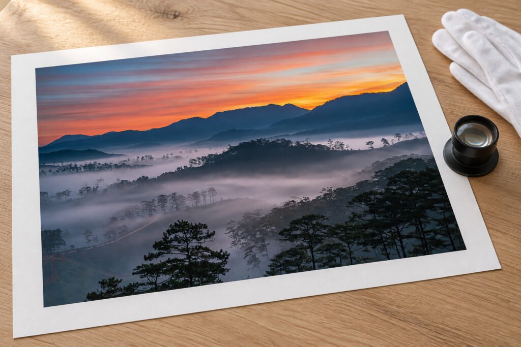
Print review table with a bordered photographic print, grey card, loupe and proof strips

Size

Plan the photograph at its final size

Start with the original export, not a compressed social-media copy. Check the pixel dimensions at the intended print size and decide whether the composition should be cropped.

A file may look sharp on a small display yet reveal limitations at 60 × 90 cm. A large print viewed from farther away can tolerate different resolution than a small portfolio print inspected close up.

Colour and monochrome

Colour photographs and monochrome work

A profile and calibrated viewing setup help control these decisions, but a physical print remains the final reference.

Colour

Saturation, skin, highlights

Paper white and surface texture alter the impression of saturation, skin tones and highlights.

Black & white

Shadows, neutrality, warmth

Pay particular attention to shadow separation, the neutrality of midtones and the way the paper base affects perceived warmth or coolness.

Series

Choose for the series, not only the single frame

A quiet matt paper can bring cohesion to a portfolio. A more textured surface can add physicality to a landscape or conceptual series. When photographs will hang together, compare them on the same media and consider whether borders and frame profiles should repeat.

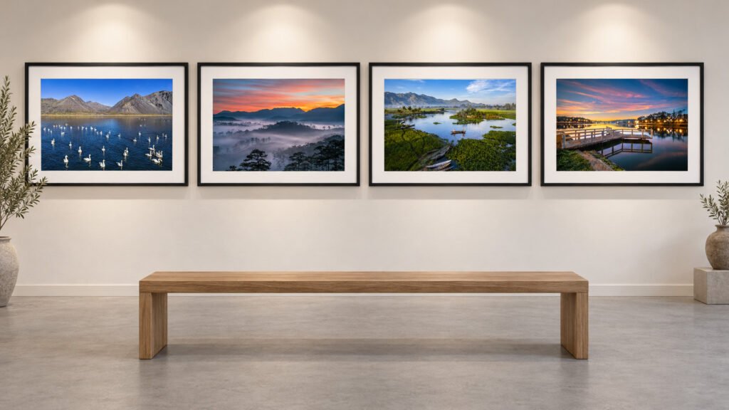
Gallery wall with a row of six framed monochrome landscape photographs

Starting points

Which paper for which photograph?

Comparison pairs from the paper guide, not fixed recommendations.

If the image depends on…Start comparing…Check especially…
Fine photographic detailPhoto Rag® 308 vs Bright White 310Shadow and highlight shape
Warm, quiet atmosphereBamboo vs HempHow paper tone changes neutrals
Visible art-paper textureWilliam Turner® 310 vs Photo Rag® 308Texture over fine lines
Bright, clean highlightsBright White 310 vs Photo Rag® 308White point in your actual room light

Start a print

Tell us what the print must do

Is it an artist proof, a saleable edition, a portfolio piece or a framed work for an interior? Give the target size, number of prints, display context and any reference print whose tone you want to discuss.

Gloved hands lifting the corner of a matt cotton print on an inspection table