



Material selection guide

How to Choose Fine Art Paper for Your Image

A material description becomes useful only when you connect it to your own image. Compare four variables: the white of the sheet, texture, how closely the print will be viewed and the quality of light where it will live.

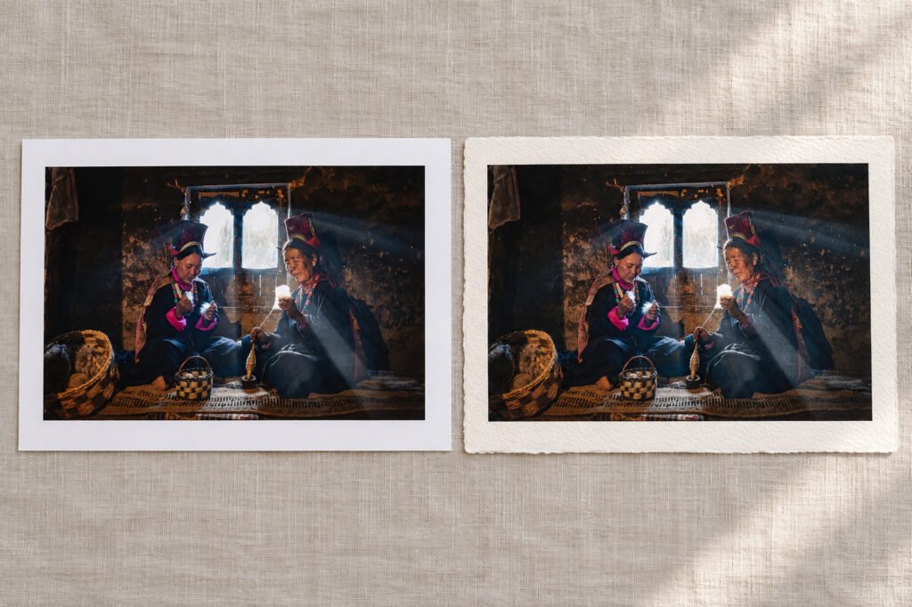
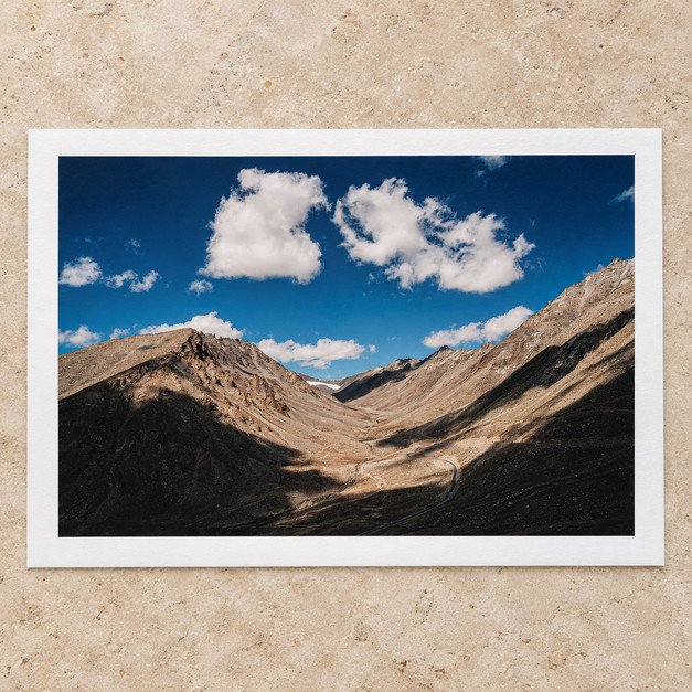
Smooth and textured fine art paper samples side by side, each carrying the same mountain photograph
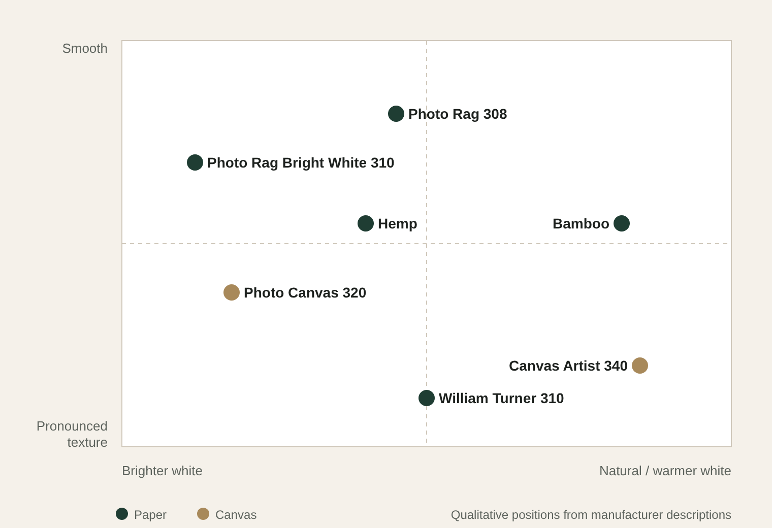
Diagram: seven Hahnemühle papers and canvases placed by paper white and surface texture

Step 1

Look at the paper white

Unprinted paper is the brightest value available in a matt print. Photo Rag® Bright White 310 offers a brighter base than naturally warm Bamboo. That changes the impression of highlights, especially when the image has pale skies, white architecture or high-key backgrounds.

A warm sheet can make muted tones feel more settled; a bright sheet can make high contrast feel cleaner.

Step 2

Decide whether texture should be seen

Inspect material from the distance at which the final print will be viewed. A texture obvious in the hand may read differently from two metres away.

Smooth white cotton matt paper sample with a mountain print

Quiet

Photo Rag® 308

Relatively quiet cotton surface.

Natural-fibre paper sample with a light texture

Light

Hemp

Lightly textured.

Warm natural-white Bamboo paper sample with a mountain print

Light

Bamboo

Lightly textured, warmer white.

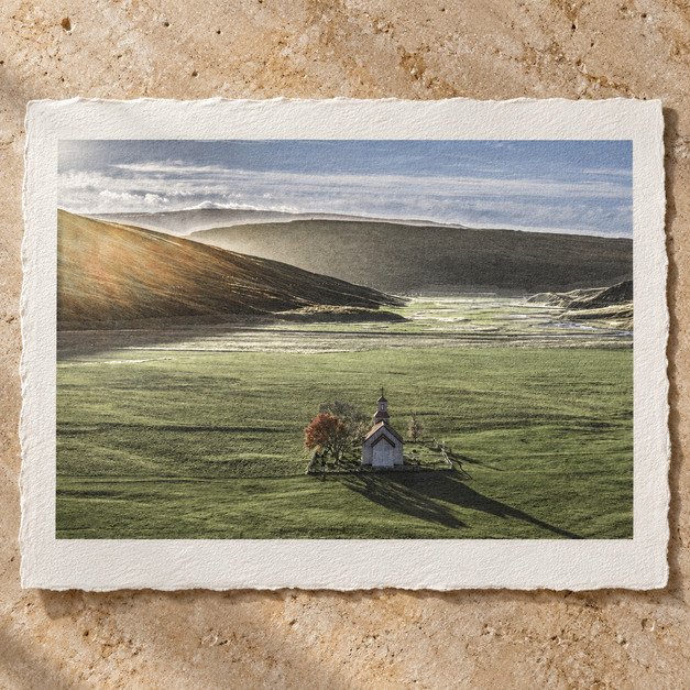
Paper sample with a pronounced mould-made watercolour texture

Strong

William Turner® 310

Strongly textured; attractive in drawing or expressive landscape, can draw attention from fine detail or small text.

Gloved hands lifting the corner of a matt cotton print on an inspection table

Step 3

Judge the difficult parts of the image

Examine deep shadow separation, subtle midtone gradients, skin tones, near-white details and saturated colours. A screen can show colour and lightness that a matt paper cannot reproduce in the same way.

The material’s coating and white point change the result; a profile helps predict those changes, but a physical test is stronger evidence for a critical work.

Step 4

Quick starting points

Comparison pairs, not fixed recommendations. Stock and print suitability need to be confirmed by the studio.

If the image depends on…Start comparing…Check especially…
Fine photographic detailPhoto Rag® 308 vs Bright White 310Shadow and highlight shape
Warm, quiet atmosphereBamboo vs HempHow paper tone changes neutrals
Visible art-paper textureWilliam Turner® 310 vs Photo Rag® 308Texture over fine lines
Bright, clean highlightsBright White 310 vs Photo Rag® 308White point in your actual room light

Start a print

Take a controlled next step

Send the image and intended size. Say what must be preserved: a specific red, soft shadow transitions, tactile character or a neutral monochrome scale. If the work is valuable or an edition master, ask whether a paid or arranged test on the final medium would be useful.

Paper, canvas and frame corner samples laid out for a print consultation